DHSC issues much delayed correction to ‘misleading’ nurses’ pay graph

The Department of Health and Social Care (DHSC) has published a revision to a graph illustrating trends in nurses’ pay that was criticised for misrepresenting wage increases, months after the graph was originally criticised by the UK statistics watchdog.
DHSC has now published a revised version of the graph in a series of ‘explanatory notes’.
Related Article: NMC chief urges employers to provide preceptorship for new nurses
Steven Nowottny, editor at fact-checking organisation and anti-misinformation group Full Fact, commented that ‘It shouldn’t have taken the Department of Health and Social Care more than two months to publish this explanatory note, particularly when the graph’s potential to mislead was highlighted shortly after it was posted online.’
Mr Nowottny added that it was also ‘concerning’ that the original graph had not been taken down or corrected on the DHSC’s Twitter page, saying: ‘This means there is a risk people will still see the original post and not be aware of its shortcomings.
‘It’s crucial that graphs present data clearly and accurately, to avoid giving a misleading impression of the information which lies behind them. And if misleading information is posted online, it’s crucial that it’s quickly and prominently corrected to avoid misinformation spreading.’
Why was the graph called ‘misleading’?
The original graph, below, was tweeted from the official DHSC account under the title ‘How nurse pay has increased’. This appeared to show that nurses’ pay had increased quite rapidly since 2020, especially for newly qualified nurses.
Related Article: What we know so far about the government’s nurse ‘Graduate Guarantee’
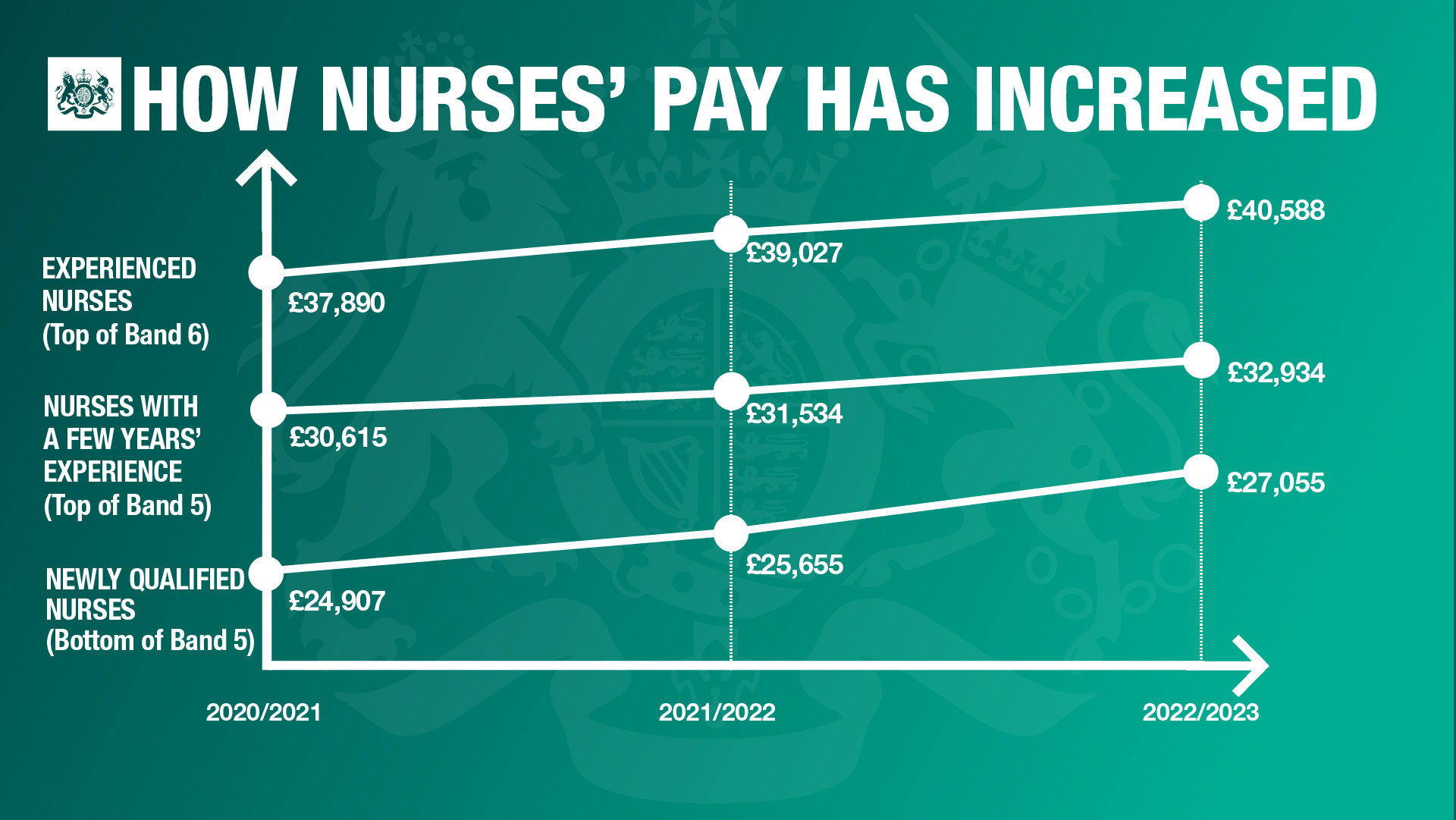
This graph was criticised because the vertical axis starts at £20,000. Sir Chote said that this ‘exaggerates the proportionate increase in pay over the period,’ adding that ‘the freehand way in which the lines appear to have been drawn suggests a bigger relative increase in pay for newly qualified nurses and a bigger pay premium for a “few years’ experience” than the underlying data justify’.
In the new explanatory note the DHSC makes no mention of these criticisms, However, the DHSC have included a corrected version of the graph. This graph shows nurses’ pay with proportional distances between the data points and an axis starting at 0.
The revised graph clearly shows a less pronounced increase in nurses pay across all bands.
Related Article: Wes Streeting: ‘If you train to be a nurse or midwife there should be a job waiting for you’
The DHSC’s explanatory note also points out that the chart makes use of ‘nominal values’ for nurses’ pay. This means that the values have not been adjusted for inflation, saying: ‘this is the way that terms and conditions are contractually defined, how pay review body recommendations and outcomes are routinely expressed.’
See how our symptom tool can help you make better sense of patient presentations
Click here to search a symptom


![Menopause: identification and management [NG23]](https://s3-eu-west-2.amazonaws.com/images.nursinginpractice.com/wp-media-folder-nursing-in-practice/wp-content/uploads/2025/03/PULSE-NIP-UPLOAD-BAYER-NICE-MENOPAUSE-A5-HANDBOOK.jpg)
