DHSC published ‘misleading’ nurses’ pay graph, says statistics authority

The Government has been accused of publishing a ‘deliberately misleading’ graph that ‘exaggerates’ nurses’ pay.
Sir Robert Chote of the UK Statistics Authority (UKSA) said a chart tweeted by the Department of Health and Social Care (DHSC) was a ‘poor and misleading representation’ of nurses’ pay and risked ‘damaging public confidence in the presentation of official statistics by the department’.
Related Article: Nursing staff ‘at risk’ amid Ebola outbreak, warns RCN
Sir Robert was responding to a letter from Andrew Gwynne MP, shadow minister for public health, who brought these graphs to the attention of the UKSA in a letter claiming that they were ‘deliberately misleading’.
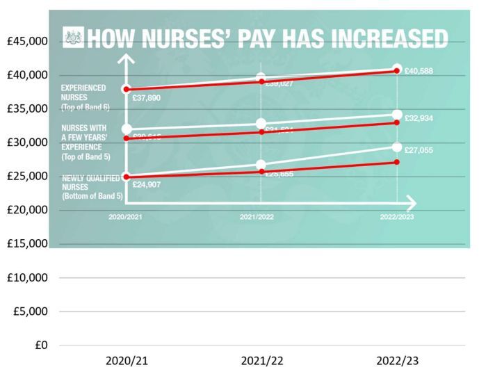
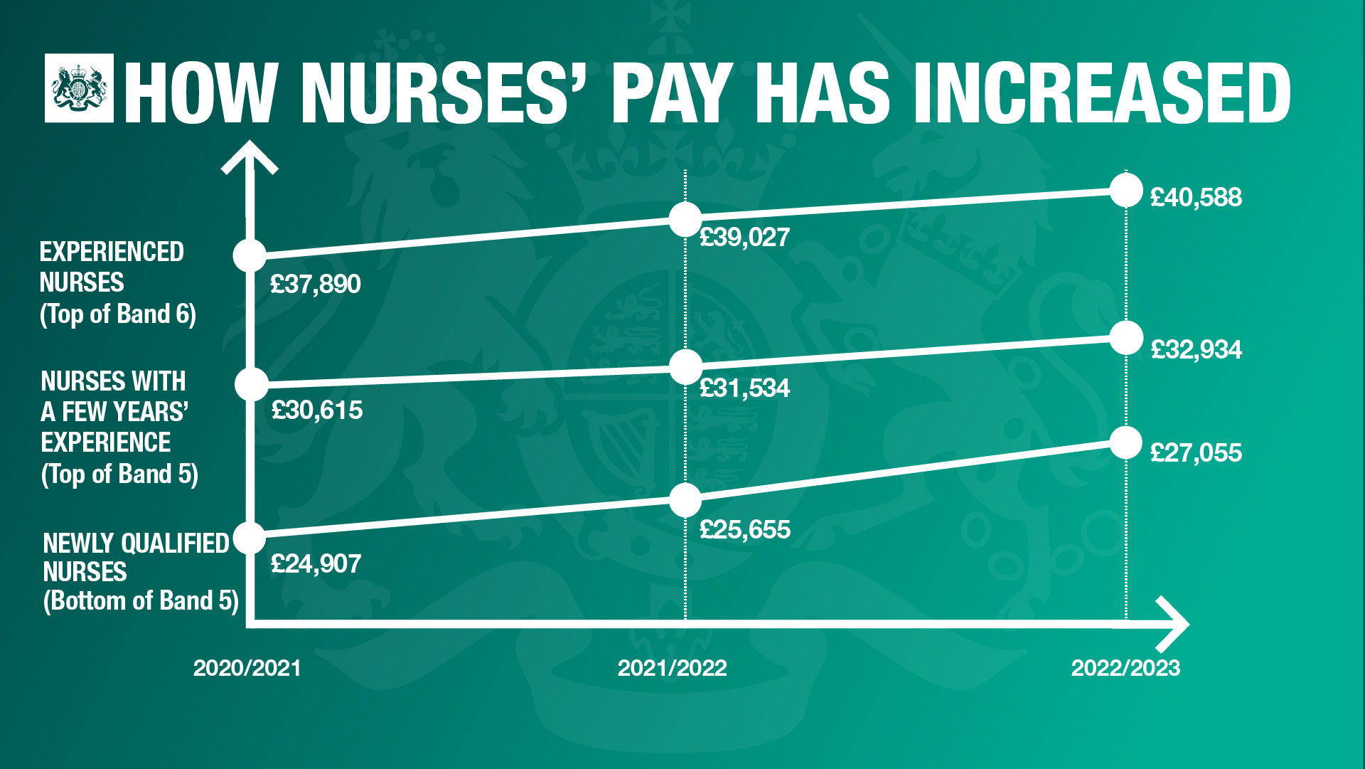
Mr Gwynne argued that since the data had been presented without inflation, and since the y-axis did not start at zero, this meant the ‘increase’ appeared more pronounced than it was in reality.
He wrote: ‘With inflation at 11.1%, it is disingenuous to claim that nurses been awarded a pay rise, when in fact the average pay of a nurse has fallen by 8% since 2010.’
While Sir Robert disagreed that presenting the data without accounting for inflation, he agreed that the plotting of the graph was misleading. Sir Robert said that since the vertical axis started at £20,000, this ‘exaggerates the proportionate increase in pay over the period’.
Furthermore, Sir Robert added that ‘the freehand way in which the lines appear to have been drawn suggests a bigger relative increase in pay for newly qualified nurses and a bigger pay premium for a “few years’ experience” than the underlying data justify’
Related Article: Former QICN chief and Wales CNO among nurses recognised in King’s Birthday Honours
The difference between the DHSC’s graph (top) and Sir Robert’s corrected graph (bottom) where the red lines represent the actual figures. The DHSC’s graph can be seen to inflate the actual pay and increase in pay over this period.
RCN general secretary Patt Cullen said: ‘This is a damning letter that warrants an official response from Steve Barclay without delay.
‘Sir Robert Chote has used the strongest terms here to cut through the government’s spin. Ministers have been found out and need to come clean.
Related Article: Lack of jobs for new midwives ‘being worked on’, says CNO
‘The government’s figures did not fool nursing staff who are sharing very difficult stories of personal financial hardship. A new and honest debate on nursing pay should show how experienced nurses have lost 20% in real terms in the last decade.’
A Department of Health and Social Care spokesperson said: ‘All of the figures are accurate but we accept the data could have been presented more clearly. We are committed to using data accurately and transparently.’
See how our symptom tool can help you make better sense of patient presentations
Click here to search a symptom